react
The <Glorpie> component, photo avatars and server components.
npm i glorpiesuse it
import { Glorpie } from 'glorpies/react'; export function UserBadge({ user }) { return <Glorpie name={user.email} size={40} label={user.name} />;}Takes every option, plus className, style and onError. Supports React 18 and 19.
photo avatars
AvatarImage shows the photo once it has loaded. Until then, if it fails, or if src is empty, AvatarFallback shows the face. Avatar sets the size and shape for both.
import { Avatar, AvatarFallback, AvatarImage } from 'glorpies/react'; <Avatar size={56}> <AvatarImage src={user.photoUrl} alt={user.name} /> <AvatarFallback name={user.email} /></Avatar>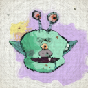

AvatarImage renders an <img> and passes through its props (srcSet, onLoad, onError, …). AvatarFallback takes every Glorpie prop except size and shape, which come from Avatar.
server rendering
glorpies/react is marked 'use client', so it can be used directly in Next.js server components. On the server it renders a placeholder in the face's background colour, at its final size and shape, so there's no layout shift when it paints.
errors
If a face fails to paint, onError is called. Without a handler, the error goes to console.error.
<Glorpie name={user.id} onError={(error) => report(error)} />